Dashboard Options (Display enabled satellites only)
General Settings
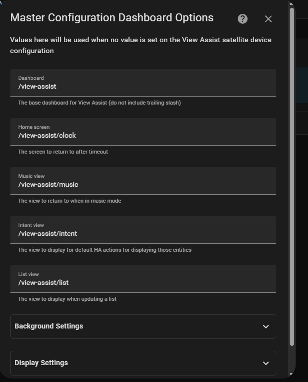
The dashboard options control different aspects of the View Assist display
- Dashboard - The base dashboard for View Assist (default /viewassist/)
- Home screen - The screen to return to after timeout (default /viewassist/clock)
- Default Music View screen - The view to return to when in music mode (default /viewassist/music)
- Intent View Screen - The view to display for default HA actions for displaying those entities (default /viewassist/intent)
- List View - The view for displaying Home Assistant list type data like shopping and to do lists (default /viewassist/list)
Background Settings
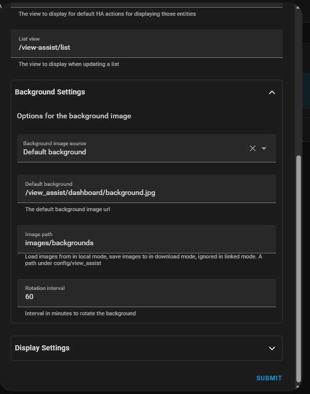
- Background Image Source - This option is used to determine how the background image is handled. The options are:
- Default background - Use a defined background image (see below)
- Local file path sequence - Picks images in their sorted order from the image path defined below
- Local file path random - Picks images randomly from the image path defined below
- Download random image from Unsplash - Downloads a random image from Unsplash website then displays it
- Default Background - An image path to use as default background for all satellites (default /view_assist/dashboard/background.jpg)
- Image path - The file path that stores the predefined and downloaded images
- Rotation interval - Time in minutes between image rotations
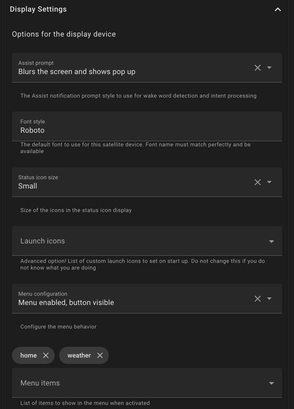
Display Settings
-
Assist Prompt - The Assist prompt style to use for wake word and intent processing (default blur pop up)
-
Font Style - The default font to use for this satellite device. Font name must match perfectly and be available (default Roboto)
-
Status Icons (See Icon Template Reference Guide below for defining custom icons)
- Status Icon Size - The size of the activated status icons shown in the top right corner
- Launch Icons - List of status icons that are always visibile
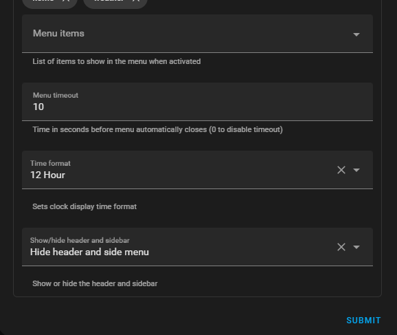
- Menu Items - List of status icons that are hidden in a toggleable menu
- Menu Timeout - Time in seconds before menu automatically closes (0 to disable timeout)
-
Use 24 Hour Time - Sets clock display to 24 hour time when enabled
-
Show/Hide Header and Side bars - Show or hide the header and sidebar
Icon Template Reference Guide
Adding Icons:
There are two ways to add status icons. By referencing a predefined or custom template, or by using the dynamic status icon format(recommended for those that do not want to edit yaml).
Predefined Templates
View Assist includes ready-to-use templates:
| Template | Description | Icon |
|---|---|---|
home | Navigate to clock view | home |
weather | Navigate to weather view | weather-sunny |
camera | Navigate to camera view | cctv |
music | Navigate to music view | music |
menu | Toggle menu display | menu |
Custom Templates
Create your own templates by editing your dashboard through the raw configuration editor and emulating the custom templates here:
# Example custom template
webpage:
  type: custom:button-card
  template: icon_template
  icon: mdi:web
  tap_action:
    action: call-service
    service: view_assist.navigate
    service_data:
      device: '[[[ return variables.var_assistsat_entity ]]]'
      path: /view-assist/webpage

# Example entity control template
living_room_lights:
  type: custom:button-card
  template: icon_template
  entity: light.living_room
  icon: mdi:lightbulb
  tap_action:
    action: toggle
  hold_action:
    action: more-info
Usage: Reference your custom template name in configuration or service calls.
  - home
  - weather
  - webpage                    # Custom template
  - living_room_lights         # Custom template
Note: If you see an orange exclamation mark instead of your expected icon, this means you are referencing a template that doesn't exist.
Dynamic Status Icon Format
Format: type:target|icon
View Navigation (view:target|icon)
Navigate to View Assist views or external paths.
- "view:weather|weather-sunny"               # Navigate to weather view
- "view:webpage|web"                         # Navigate to webpage view
- "view:/lovelace/dashboard|view-dashboard"  # External dashboard
- Paths without
/are prefixed with/view-assist/ - Paths with leading
/are used as absolute paths
Entity Control (entity:entity_id|icon)
Control entities with tap to toggle, hold for more-info.
- "entity:light.desk_lamp|desk-lamp"                  # Single icon
- "entity:light.bedroom|lightbulb-on,lightbulb-off"   # Dynamic icons by state
- "entity:switch.fan|fan"                             # Toggle switch
Dynamic Icons: Use icon_on,icon_off format for state-based icon changes.
Service Execution (service:service_name|icon)
Execute Home Assistant services on tap.
- "service:script.good_night|sleep"        # Run script
- "service:homeassistant.restart|restart"  # Restart HA
Dynamic Management with Actions
For runtime management of status icons (adding, removing, or toggling menu), see the Status Icons Actions documentation.
These actions allow you to:
- Add icons temporarily with optional auto-removal timeout
- Remove specific icons
- Toggle the menu visibility
Icon Specification
- Use Material Design Icons without
mdi:prefix - Browse icons at Material Design Icons